Hi there,
my proposal is simple but effective:
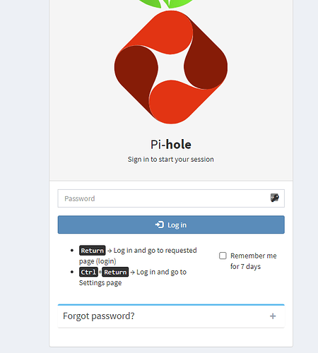
Change the size of the Login button to the soze of the Forgot Password button and vice versa.
Size equals importance. Until most pihole users remember (hopefully) their password, the login activity should get emphasized and the forgot pw activity de-emphasized.
After entering my pw I almost always hit spontaneously the forgot pw button, instantly remembering to hit the other smaller button ...
Maybe you guys can change the optics a little. Since pih is getting better and better this would make my day (and others probably too).
Cheers
Axel
Hi there,
there is nothing to add to my initial post from 2017...
This ist still a usability issue. And so easy to fix. I cannot see why this ist not being fixed already.
A little analogy: imagine your car horn would be replaced with the engine start button and vice versa. Wouldn't it be really awkward?
I guess on the face of it, it is a button, but it's actually the header for a collapsable box (about half way down the page), which expands to show the details on how to reset the password. But I see your point, I think.
I'll try to have a play about with the layout, though if you feel you're up to it, pull requests are always welcome 
For the first time I tried it. But then I'd learn and adapt.
3 Likes
Keep in mind I'm no web designer, but how about something like this?
And removing the emphaisis on the expander that contains instructions on how to reset the password.
(this was just mocked up in the "view element" editor on chrome)
People know they can type the password and hit ENTER to keep from having to click any buttons at all, right?
1 Like

