A graph visualizing response times of forwarded queries!

Hello everyone,

I wanted to show you something I have been sitting on for a while but am finally ready to share.

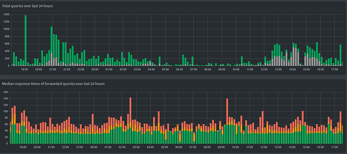
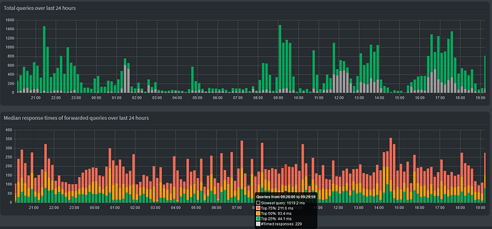
What you are looking at is a graph on the dashboard that visulizes the response times of forwarded queries in the form of quartiles (median + median of upper half + median of lower half). I decided against simply plotting the mean (aka average), since that is affected too much by outliers and not representative of what the DNS experience feels like.

The dashboard already shows us data about the number of allowed and blocked queries, even on a per device basis. It breaks down all queries in their types as well as the upstream DNS server. We also got information about which domains are hit the most of often, be that allowed or blocked, and also a rundown of which devices are the most active. Showing us a relatively rough visualization about what the response times look like was the last thing missing from a comprehensive overview.

The graph is not hidden behind authentication, it shows up without being logged in just like the total queries graph.

Statistics about the response times do not differentiate between different upstream DNS servers or query types. When using four of Cloudflare's DNS servers, the response time is very consistent. The dips in the middle are where there wasn't much traffic besides Pi-hole's hourly PTR queries, which were send to my FRITZ!Box. These usually take <10 ms and pull the graph down if there isn't any other traffic to overshadow them.

Unbound on the other hand... It's not the fastest or most consistent available DNS server, but it's also not so slow that I would notice during everyday browsing. The graph is here probably more relevant to spot strange delays/outages than when using commercial upstream DNS servers.


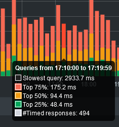
Two close-ups of the tooltip. Displayed are:

  • Black: The absolute slowest query within a given interval (not shown in the graph itself)
  • Red: Upper quartile (75% of all queries were faster than this value)
  • Yellow: Median (50% of all queries were faster than this value)
  • Green: Lower quartile (25% of all queries were faster than this value)
  • White: The number of timed queries (only forwarded queries with the response_calculated flag)(not shown in the graph itself, it's not a time, duh)

Tooltip of the median response time graph showing data.

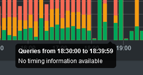
If the number of timed queries is zero, the tooltip will simply say "No timing information available":
Tooltip of the median response time graph displaying "No timing information available".


The reason why I had been hesitant to create a feature request before is that the response times were never saved to the database and therefore the graph would "break" every restart. Not a huge issue for me, but not something that should plague a final product. But now that FTL#1285 is merged, this won't be an issue in future versions (that said, my code does include a little fix in that regard).

Code for the AdminLTE and FTL repo is here (no changes to the core repo) (PR on demand :slight_smile:):


Feedback appreciated :smiley:

Impressive work!

However, I'm having a hard time to intuitively interpret the graph. Maybe it's because I'm more used to see representations of such data in form of a box/whiskers plot. Any chance to have such a representation?

Thanks.

No, chart.js does not provide a box and whisker chart on its own, so this bar chart is the closest I can do. It's also more consistent with the surrounding Total queries and Client activity graphs. That functionality could be added, though, via https://github.com/sgratzl/chartjs-chart-boxplot, but it looks like that requires the raw dataset, meaning I need to change how FTL returns the response time data before I can play around with new plots.

Great addition! I would love to cast a vote but unfortunately was out of vote...

My personal me says "I want this", but the Pi-hole version of myself has a a more differentiated view. :wink:

I like the looks, and as I am fond of statistics, this scratches a personal itch.

To make the tooltip clearer, I'd probably be more expressive and change "Top 75%" to something like "75% faster than", and I'd change "Slowest query" to "Slowest response" as well (as it seems it is not the entire client's query, but the upstream's response we're measuring here).

At the same time, I personally don't think it is adding much value for the average user.

Pi-hole's dashboard is trying to provide users with actionable information about their network, e.g. which client is causing peaks at night time, or which domains do I need to block or unblock.

So naturally, for me, this stirs the question:
What would users do with information from those statistics?
What action would be required, e.g. seeing sudden surges in response times at 02:40 and 09:30?

Upstream latency is something outside your network.
In case of a single upstream, the data plot would be close to resembling the load of an upstream DNS server over time. For multiple upstream servers, the significance would become less clear.

Upstream latency is not something that Pi-hole has control over or users can do much about.
Granted, they could switch their upstream servers to a faster one, but that would not be something that would afford constant user monitoring over time - mainly because Pi-hole is already preferring the fastest responding configured upstream anyway, but also because I find it hard to imagine users switching their upstreams every few hours because OpenDNS is 10ms faster than Cloudflared or Quad9's slowest reply time was twice as high as Google's.

At the same time, I would be concerned that by simply showing those stats we'd overemphasise the importance of speed and discourage users from choosing upstreams for other reasons like availability of DNSSEC or improved privacy.

Take unbound, for example: unbound will always be at a disadvantage in such a comparison, as it has to turn one query into many in order to traverse the whole chain of authoritative DNS servers for a given domain, plus verifying each reply via DNSSEC. By its very design, this will always be measurably and signifcantly slower than asking a simple public resolver without DNSSEC validation. Yet in day-to-day use, as you've observed yourself, you won't perceive much of a difference.

And finally, I wouldn't be particularly fond of the additional support load this may create, where we'd have to explain to users why they shouldn't care too much about latency and its fluctuation over time when picking their upstreams (anticipating questions like "Why did you recommend unbound when my network now is three times slower than with Comodo before?" or "Why did my network speed suddenly drop by 40%?" where we have to figure that they switched to DNS.WATCH with DNSSEC).

Personal itches aside, I wouldn't show latency over time on Pi-hole's dashboard.

I just found some time to look at your proposed addition and am impressed by the work you invested. I agree with the raised concerns about what would be the gain in knowledge for the average user. Let me approach this from another perspective: The API is overall tuned to return as fast as possible and uses pre-calculated statistics to never have to iterate over all the queries Pi-hole has in memory (that can be several (!) couple of millions for extreme users). Being in the API code will block DNS operation while this is running. I have seen no numbers but I don't think this is a wise thing to do on the dashboard for every refresh. How does it behave on the low-low-end Raspberry Pi Model 1B devices (which are also still explicitly supported by Pi-hole)?

So while I value (I really do!) your effort (not limited to this proposed feature here but also in several other places!), I don't think we can and should add this. What we could have as a compromise might be something like three min/max/average values we could show on some "in-depth" (this name is not set into stone) page. May it be one page on its own or on the first tab of the settings page.

Computing these three values is efficiently possible without any effort at all: min and max is obvious, average can be live computed from sum_of_all_response_times/number_of_responses where sum_of_all_responses += reply_time and number_of_responses += 1 on every receipt of a response where we compute this time. This can even be per-upstream values so all-queries users will benefit from it too, given that its not always the same server serving the first reply. This may provide even more interesting figures for the average user.

1 Like

The compromise is also great to have, but I think the X th percentile is better at reflecting the actual results. Averages are easily skewed by a few per cent of abnormal queries.

1 Like

5 posts were split to a new topic: Feedback on feature requests

It would be great to have more insight in the resolving speed. Wouldn't it be useful to have a comparison between the currently set upstream resolver and the other (GUI) available upstream servers?

For example, you've set Google as the upstream server and like to see the current performance of Cloudfare or a local Unbound recursive resolver. Doesn't need to be something fancy I suppose (in terms of presentation).

Pi-hole already does this comparison for all your selected upstream servers, and the results are reflected in the forwards Pi chart in the dashboard. The fastest upstream servers get the majority of the traffic.

https://docs.pi-hole.net/ftldns/dns-resolver/#improve-detection-algorithm-for-determining-the-best-forward-destination

1 Like

This topic was automatically closed 180 days after the last reply. New replies are no longer allowed.