Improve hints and help text for Lists is a great addition, but it's in the wrong place.
It should be at the top of the Subscribed lists area in the space between Show x entries and Search.
Improve hints and help text for Lists is a great addition, but it's in the wrong place.
It should be at the top of the Subscribed lists area in the space between Show x entries and Search.
Most of the times the placement of some items on an interface is a matter of personal taste, but in this case I strongly disagree with your request.
The "space" between Show x entries and Search is far from ideal.
In larger screen it looks like a big space, but in smaller screens (1080px wide or less), this space is too narrow to add the hint and icon legend. From my quick measurement, when the page is 1080px wide, that space would be around 80-100px smaller than the need space for the icon table (considering margins).
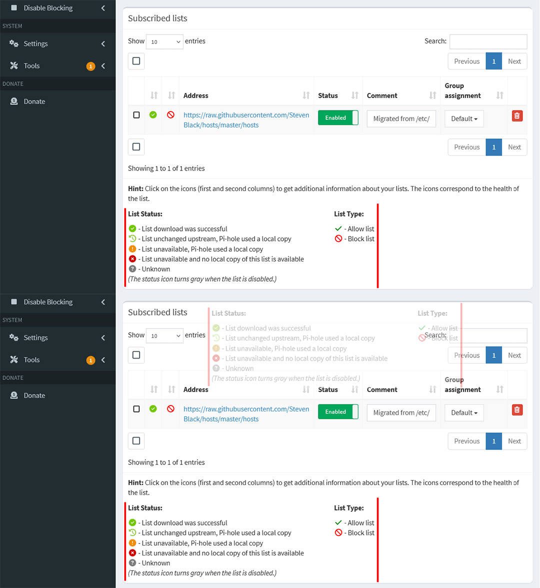
Also, note that when there are more pages, the pagination controls will expand, making the space even smaller.
This is even worse in really small screens, where the Show x entries and Search controls are on their own lines, one above the other. In this case there is no space between them.
This request would break the usability for users using phones or tablets.
Understood.
Moving the List Types information above the List type column would help the problem of fitting the List Status information in the space between Show x entries and Search.
