After updating to version 5.0, I really missed the smooth graph style on the Dashboard. Something about the way it looks when you load it up just sits well with me. I don't know if I'm the minority here or not, but I do know I would greatly appreciate an option to re-enable the old, smooth style. This is obviously not a priority feature- it is simply a small change to add the option to choose the aesthetics you prefer.
Thanks for your time.
Sorry if this isn't the place to ask something like this! If I'm in the wrong place, could someone please point me in the right direction? Thanks.
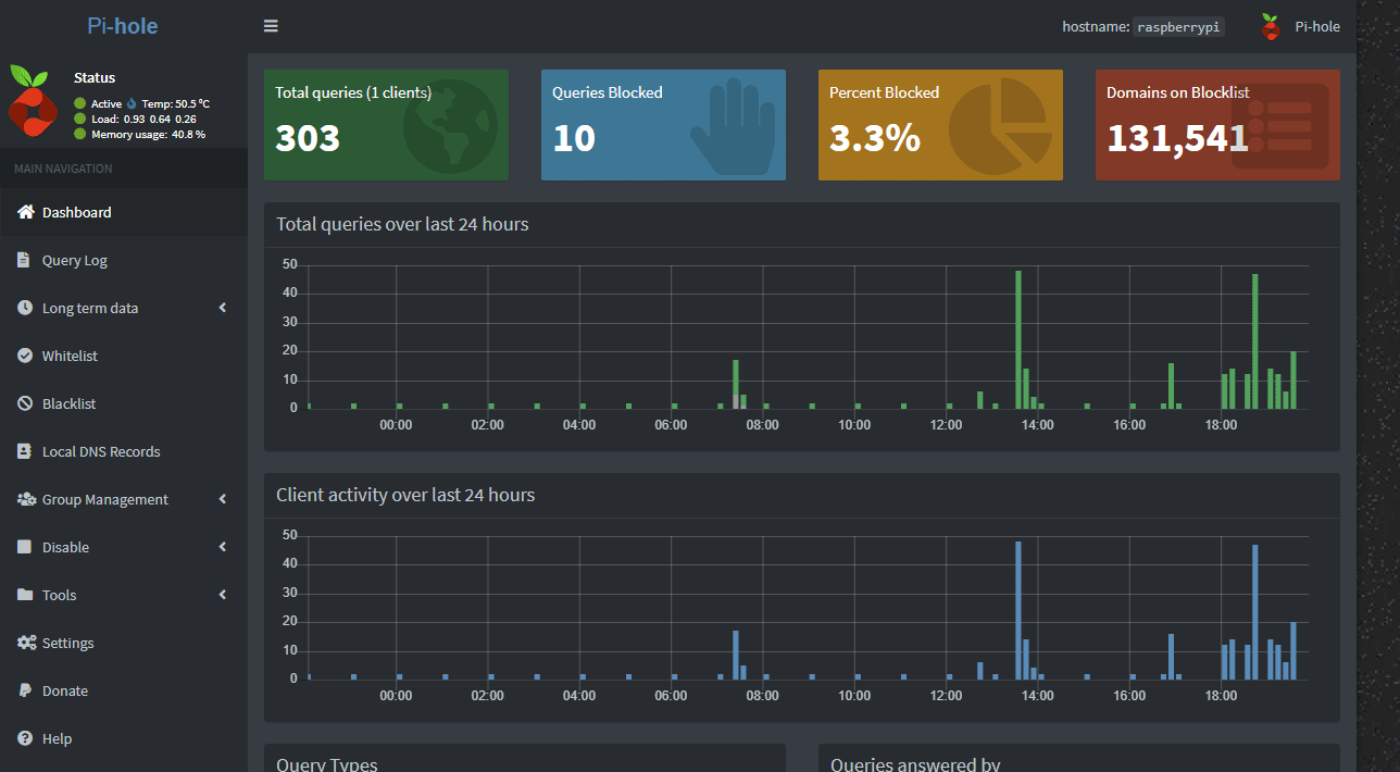
Absolutely the right place. I guess we can see where the feature request goes... The bar graph was chosen to replace it because it more accurately reflects what has actually happened.
Unfortunately in order to make a change, we have to disappoint a few people, such is the fun of coding user interfaces.
I really want this feature back as well because I think a graph looks better than bars. I agree that to have just an option to choose one or the other would be really nice! Just let the user decide which one of the two he/she likes the most I absolutely love this pi-hole because it's the only solution I've found to almost completely blocking stupid mobile games ads on my phone without rooting it.
Adding my voice to this, was pointed here from a discussion on Reddit.
Have managed to revert it myself as a temporary solution (thanks to one of your team for pointing me to the relevant commit on GitHub!), but an official toggle would be fantastic in the long term though.
You tease, d00nicus - please post a link to that GitHub page you mentioned.
+1 here for the old graphs back or a way of toggling them (even if it's a matter of you having to select which one you want on installation). It's an eye candy thing - if you Google reviews for Pi-Hole you will often see people mentioning the pretty graphs. Personally I just find the smoothed line graph much easier to interpret at a glance, especially with multiple clients that all have similar usage (the graduations in the bar chart are too small - perhaps I am a little colour blind or my monitor's resolution / pixel density isn't good enough to show this up adequately).
It'll require digging around in the Javascript side of things to undo, but isn't too tricky. I've got no idea if it will cause issues when updating so definitely take backups first
This will (pending approval and merge) be implemented in the next release
Bar will be default, but you will be able to switch it off. It's a low-maintenance tweak.
If anyone is making changes to their local web admin pages, bare in mind that you will need to reset them before upgrading to the next version (please don't ask for an ETA!)
Where can I change the graph back to the better graphs. Bar graphs are not acceptable to me. I can understand that there a small number of people who may like bar graphs but from what I am seeing in this thread it doesn't appear they are the majority.
Since upgrading I thought I did something wrong. Wow! It's not my fault for once.
I suspect the majority of users like the bar graphs, based on comments here and on Reddit. Those who don't like them have commented here and voted for the feature request.
 I absolutely love this pi-hole because it's the only solution I've found to almost completely blocking stupid mobile games ads on my phone without rooting it.