I noticed a spike in requests. Is there any way to view a summary during this time when I click on the tall bars? I'd like to investigate. Say, the domains that had the most requests. Or the most active clients during this time.
Mouse over the column of interest and you will see a pop-up with additional details:
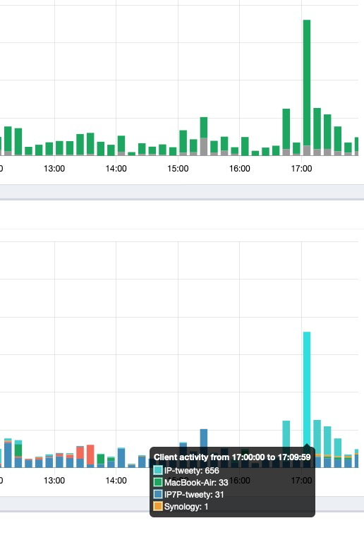
Then click on the popup and that time interval in the query log will open.
Are there any visuals, like a pie chart, for example, showing 1000 visits to google.com, 150 to youtube.com, etc.?
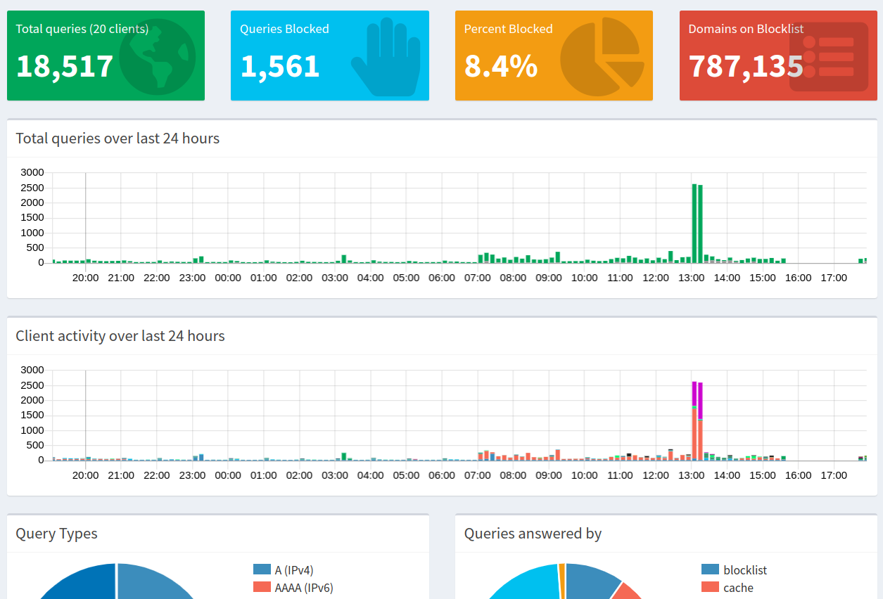
There is the dashboard display for the past 24 hours which shows a simple bar chart for the top permitted and top blocked domains 910 each)
In the long term data section of the web Admin GUI, you can select a specific time interval and then display graphs for that data. Similar to the dashboard, if you click on the bar graph for a time period of interest, you can see a summary of queries and you have the option of filtering by query status.
Using SQL commands, you can directly interrogate the long term database where the query history is stored, to get the specific details you want. Examples:
pulls 24 hours from the database for a client
sqlite3 /etc/pihole/pihole-FTL.db "SELECT domain FROM queries WHERE client='192.168.0.132' AND timestamp>='$(($(date +%s) - 86400))'" | sort | uniq -c | sort -n -r | head -10
top blocked domains (limited to 20 in this instance) for the past 7 days
sqlite3 /etc/pihole/pihole-FTL.db "select domain, count(domain) from queries where timestamp>=strftime('%s','now')-604800 group by domain order by count(domain) desc Limit 20"
This topic was automatically closed 7 days after the last reply. New replies are no longer allowed.