Hey all,
got 2 nice to have feature requests:
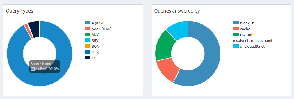
- Sort "query types" and "queries answered by" by most used.
- Add hits / Percentage behind the "query types" and "queries answered by"
Hey all,
got 2 nice to have feature requests:
I'm not certain I'm following. The data is shown as a pie chart, and each pie slice expands and contracts as the percentage for that slice changes. The colored boxes with legend descriptions are the legend that identifies each pie slice. Typically, legends are static so you can always find the description for a pie slice in the same location on the legend.
What behavior do you want to change? The organization of the legend, or the order of the pie slices?