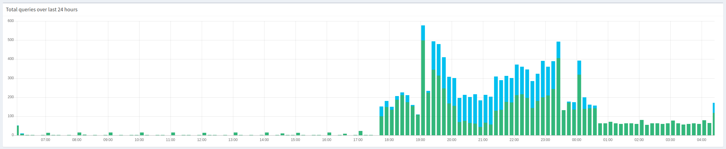
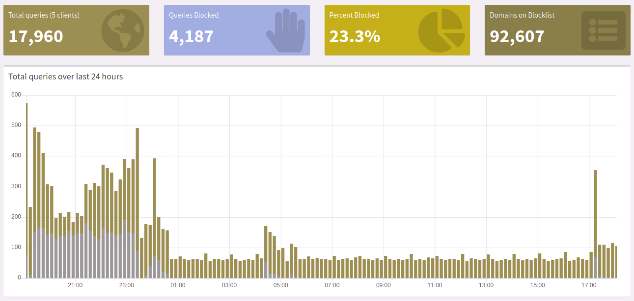
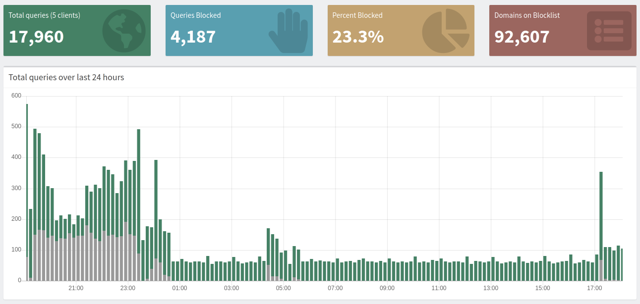
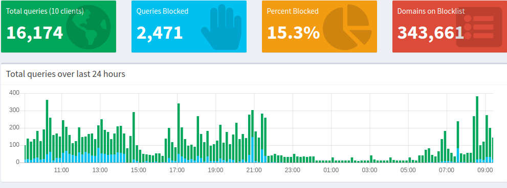
On some days I have more blocked queries than allowed queries. This leads to percent values higher than 100 percent when I mouse over the graph.
I believe this is wrong, because I would understand the percent value as the percent off blocked queries in the sum of all queries (blocked + allowed).
Hi hoFFy84, welcome in the pihole community.
There is already a fix for this but it has not been merged yet.
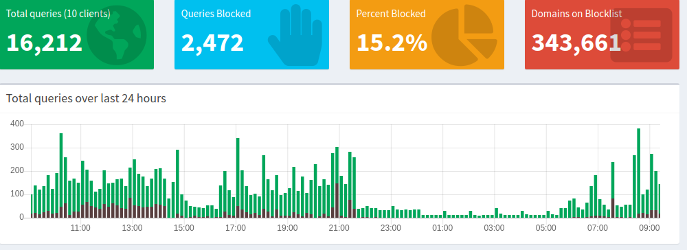
Looks good now! 
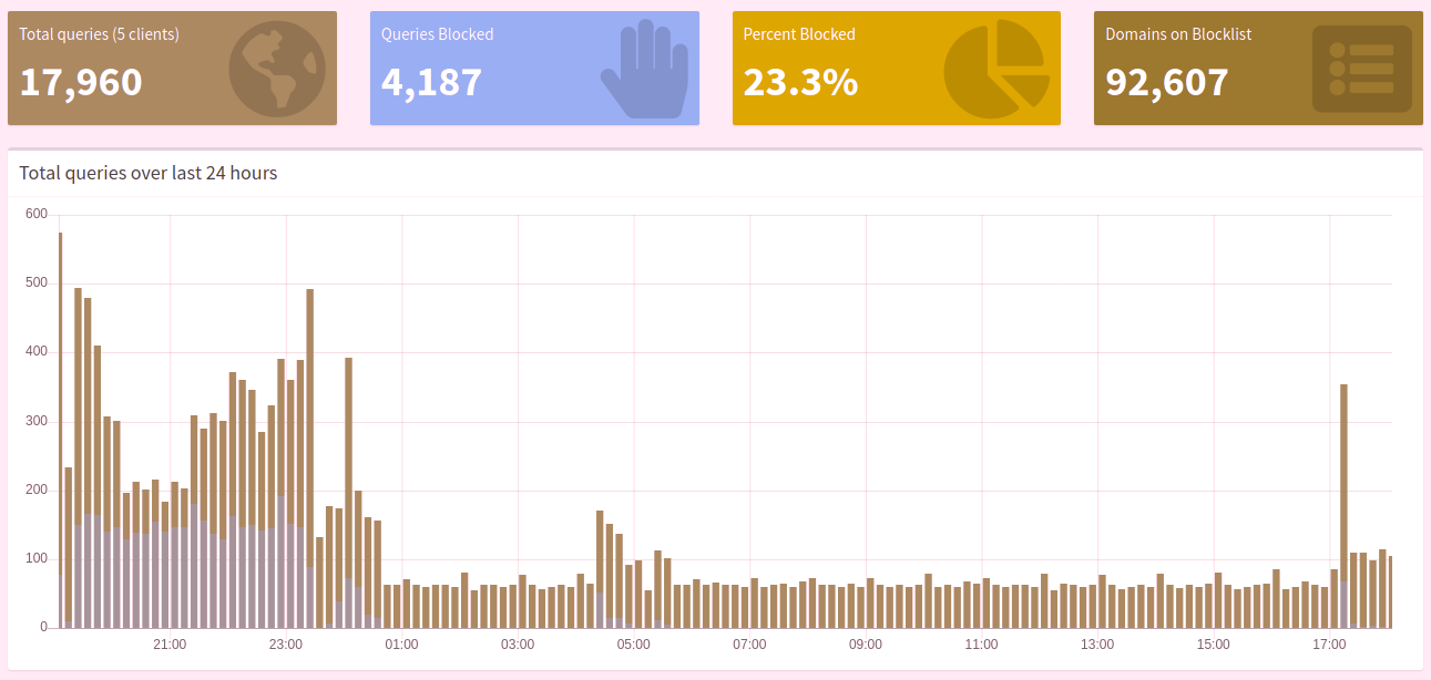
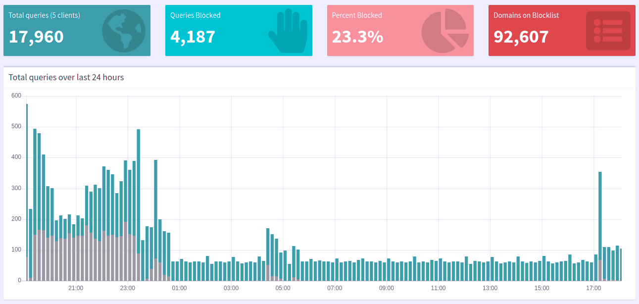
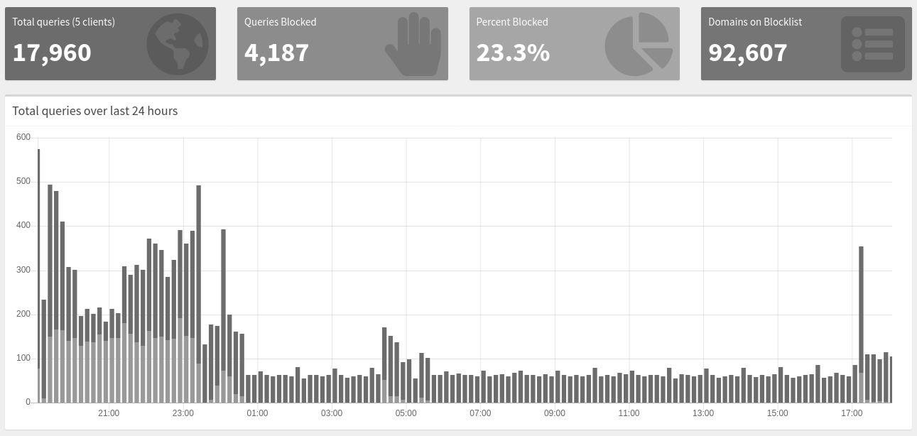
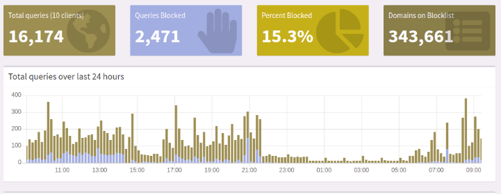
I'm not colorblind but the new colors are not easy to distinguish. Any chance to keep the changes but revert the colors?
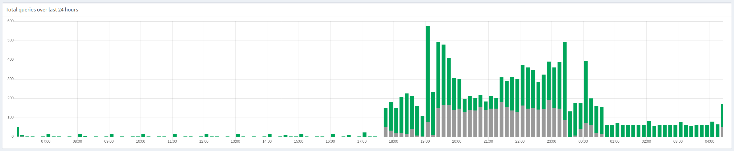
I think the new colors are easier to distinguish than the old, and match the content as well. Grey are bad (blocked), green are good (not blocked).
1 Like
Looks fantastic. Very easy to see and understand!!! Thank you.
Both color choices perform bad in contrast ratings, the new even worse.
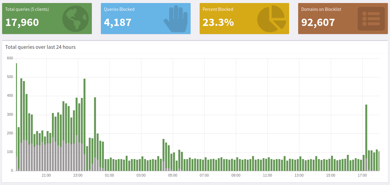
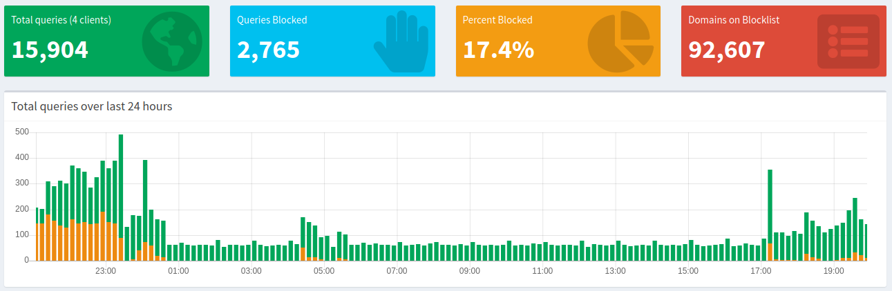
I like the green/gray combination...but now the new colors don't match the ones of the big blocks Total queries (x clients) (green) and Queries Blocked (blue) at the top of the interface anymore.
I'm not against a green/gray combo but please improve contrast.
There is even a feature request to enhance pihole's accessibility by choosing "colorblind friendly" colors - why not start now?
High-contrast does not necessarily mean "better". It may actually mean disturbing.The graph shouldn't be all that colorful in my opinion. It isn't the most important thing about Pi-hole.
Why is this relevant? We never try to use shady green text on shady gray background or vice-versa. The page you referenced does only seem to compare foreground + background color sets. This is not applicable here.
Edit I did do color-blind simulations to ensure every user can distinguish the two bars:
Normal

Read-Weak
Green-Weak

Blue-Weak
Red-Blind
Green-Blind
Blue-Blind
Monochromacy
Blue Cone Monochromacy
It doesn't need to be colorful but I think it is important that one can easily distinguish where one entity ends and the next starts. The graph displays only two information over time: total queries and blocked queries. While green total queries are good distinguishable against the white background, I think the grey blocked queries are not good distinguishable against their green background. This emphasis the total queries over time, as the fraction of blocked queries is harder to see (which makes them appear less important).
Why not? Of course it is not text on background but with only small gaps between the bars it is almost like a fulfilled green background with another color overlapping in the foreground.
Maybe I'm hidden colorblind but I see monochromoacy best.
As it seems that I'm the only one preferring a different color choice I will stop arguing.
With background you mean the neighboring bars, I assume? Note that the bars are stacked on each other. The gray bars are not overlaying parts of the green bars.
Ah, I see. I don't have this impression.
That's not my point, but how about a specific color suggestion so we can look at this? You know, we already try to get to the best solution together!
If you first want to try it yourself before suggesting something, run
timeLineChart.data.datasets[0].backgroundColor = "#ED8A10"
timeLineChart.update()
in your browser's Developer Tools Console.
This will immediately lead to a preview without the need to poke around in the source code!
(maybe a bit too colorful for my taste, but nothing is set in stone)
This orange color choice doesn't look all that distinguishable for red-blind people:
(check your own colors at Coblis — Color Blindness Simulator – Colblindor)
edit We can likely shift the color selection to v5.1 to not delay the v5.0 release process any further. Who known, maybe someone even volunteers to write a theme manager? If there are users who would like to work on themes, we may be able to offer this. However, implementing theming and then picking and optimizing/matching colors might be a bit much.
That's awesome.
A bit overkill
I quickly tried three combinations
-
#00C0EF (which is the color of the blue header "Queries Blocked")
With red-green blindness
-
#003DA3 (a deep blue)
red-green blind
-
#583F3F (more black-reddish)
red-green blind


My personal favorite would be something like the deep blue.
I agree. As it is with colors and taste everyone has it's preferences. It's unlikely that everyone will be happy to the same extend. I'm not tied to any specific color-combination but want to raise awareness to such things like accessibility and colorblindness. I think it is important to keep such things in mind when UI decisions are made - it's harder to revert things when they are already public.
I'm aware of them and try to do my best (sometimes limited by the available time, I must admit). User-definable colors will come at some point, at least user-provided (and -editable) themes. Having said "editable", I feel the need to express that I'm not looking forward to add a full color picker solution into the dashboard, however, there won't be much experience needed to simply replace some colors in CSS definitions.
See