You know, when we're already doing it, then we can also do it properly.
I pushed a few more commits and it should now be mostly done. When you mean thinks like check boxes or textbox resize-manipulators
then I don't have good news: They are controlled by the operating system on most browsers. We cannot do much about them without a lot of effort. However, if you know other projects knowing how to do it, I will certainly take a look at them.
I know were talking about design and taste again, but I noticed you also modified the "light theme" in new/dark.
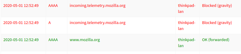
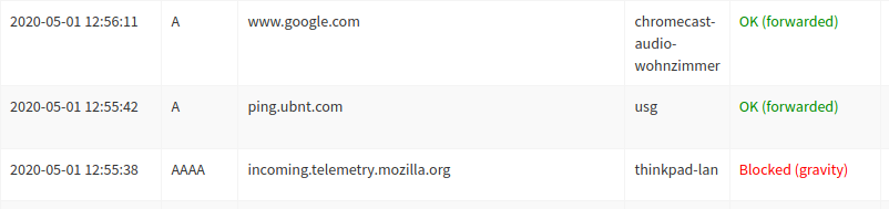
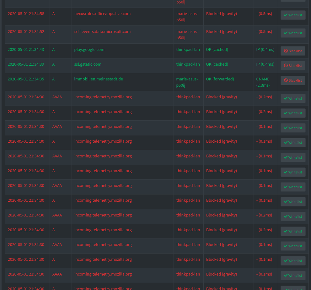
I found it quite useful to see the whole row colored (red=blocked, green=permitted) instead of only the status colored.
With the whole line colored, already a quick gaze was sufficient to see if a domain was blocked. Now I have to shift to status to see if it was blocked or not.
I agree. I felt this change necessary because it was hard to read the text on the dark background. Whichever green I tried, it was difficult to read. Too dark variants (like the original green color also in your screenshot above) had too little contrast to be readable, too bright ones hurt the eye without being more readable. Suggestions are welcome and I'll be more than happy to change this.
edit Pushed a change to restore entire row coloring.
Styling is only done through CSS classes, it would be a lot more complicated to have features (and this would be one) to depend on the selected skin.
Please try with the most recent push, I made the green a bit brighter in dark mode, it seems to work for me now, but my laptop is already in night mode and the screen is dim (battery almost empty) so this may not be the best reference.
nanopi@nanopi:~$ pihole -up
  [i] Checking for updates...
  [i] Pi-hole Core:	up to date
  [i] Web Interface:	update available
  [i] FTL:		up to date
  [i] Warning: You are using FTL from a custom branch (release/v5.0) and might be missing future releases.

  [i] Pi-hole Web Admin files out of date, updating local repo.
  [✓] Check for existing repository in /var/www/html/admin
  [i] Update repo in /var/www/html/admin...
  : Could not update local repository. Contact support.
No, only the buttons differ (mainly to show in code how to do this:
(first element is the description, second one the style sheet, third one the radio/checkbox style, fourth one the radio/checkbox style variant (colors are modifiable for the simple minimal style)).
I will likely only keep the midnight one.
Aggressive as in "too bright" or "too dark" or ... ? Even if there is the danger of repeating myself: Suggestions welcome!
EDIT
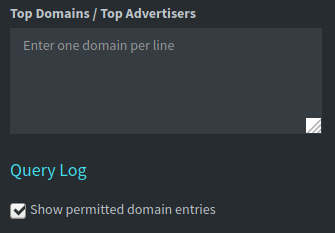
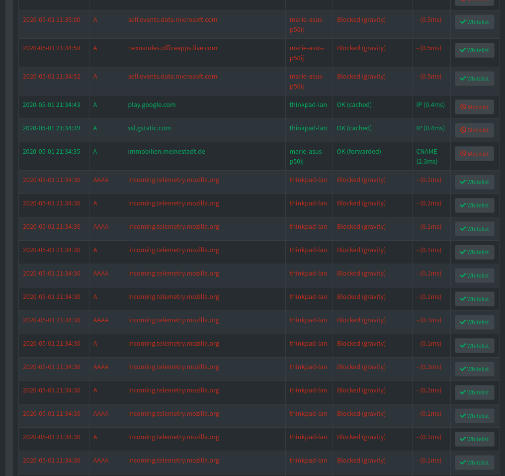
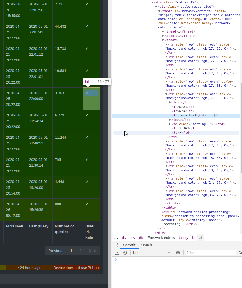
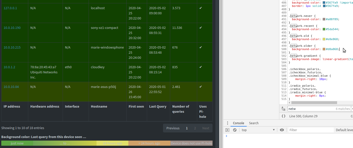
I wanted to modify the network table as well but could not find a (how do you call that, item?) in the default-dark.css. It looks like the rgb are set for every row separately.
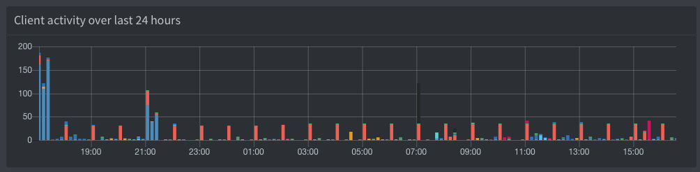
I am digging the dark theme. One thing that has popped up for me today with it is a couple of the bars in the activities table on the homepage is almost black. I was trying to figure out how to change it but am not a programmer of any kind. It might be worth filtering this color out in the dark theme (maybe replace it with the inverse).